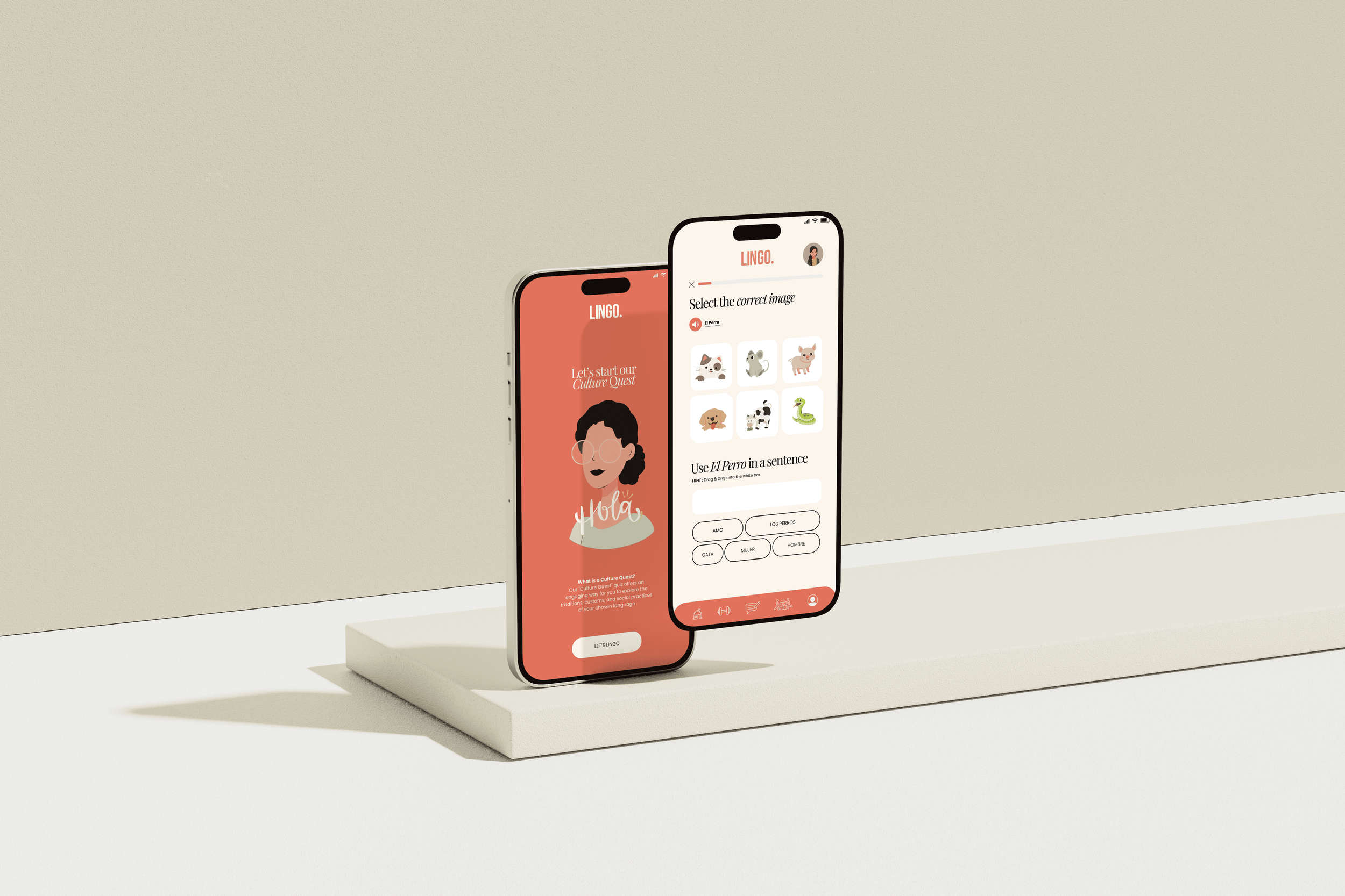
A user-friendly, iOS-compatible language learning app that makes mastering new languages fun and engaging with interactive lessons and real-time feedback.
Lingo
CLIENT
LINGO (CONCEPTUAL PROJECT)
PROJECT TIMELINE
JANUARY 2024 - MARCH 2024
MY ROLE
LEAD UI/UX DESIGNER
INDUSTRY
EDUCATIONAL TECHNOLOGY
OVERVIEW
Project summary
WHAT I DID
User Research & Analysis, Information Architecture, Sitemap, Wireframing, Design, Prototypes, Usability Testing, Branding
ABOUT
The market for language learning apps still has untapped potential, especially for platforms that address specific niches or underserved audiences. While many apps focus on broad, gamified experiences, there’s room for tools that cater to deeper cultural immersion, regional dialects, or industry-specific vocabulary. Additionally, integrating AI for personalised learning journeys and real-time feedback, or fostering community-driven content like group practice sessions, would add value. With growing globalisation and remote work, a fresh, innovative approach to language learning could captivate users seeking tailored, meaningful connections to new languages.
GOALS
The goal of this project was to create a language learning app that offers a more personalised and meaningful experience for users. It aims to address gaps in cultural immersion, regional dialects, and specialised vocabulary for various professions. By leveraging AI and interactive tools, the app provides tailored learning journeys that adapt to individual goals. Ultimately, it seeks to help users build real-world connections and confidently engage with new languages.

“Learning another language is not only learning different words for the same things, but learning another way to think about things.”
- Flora Lewis
THE CHALLENGE
What challenges do new language learning apps face in a saturated market?
Creating a new language learning app in a saturated market comes with significant challenges, as competition is fierce and user expectations are higher than ever. To succeed, an app must offer unique value while addressing common pain points better than established platforms. Balancing innovation with usability, standing out amidst extensive advertising budgets, and maintaining long-term user engagement are some of the hurdles developers face. Additionally, gaining visibility in app stores and fostering trust among users requires a strategic approach.
Key challenges include:
Differentiation: Offering unique features or niches to stand out from well-known competitors like Duolingo or Babbel.
User retention: Keeping learners motivated and engaged beyond the initial download phase.
Visibility: Competing for attention in app stores and online with larger, established brands.
Monetisation: Striking the right balance between free content and premium features without alienating users.
Cultural relevance: Ensuring content resonates across diverse global audiences while staying localised and authentic.

WHAT HAPPENS WHEN
The timeline
THE AUDIENCE
User personas
WHO IS THE COMPETITION?
Competitive audit
USER FEELINGS
User journey
THE LAYOUT
Information Architecture
BLUEPRINT
Sketches & wireframes
THE LINGO STYLE
Style guide & UI graphics
The Lingo style guide presents a clean, modern, sophisticated aesthetic, blending bold contrasts with soft, welcoming tones.
Welcome to Lingo
The Lingo language app has a stylish and approachable design that emphasises simplicity and engagement. It invites users to dive into learning with confidence and ease, leveraging a friendly and modern aesthetic
Features include daily bite-sized lessons, personalised learning paths, and speech recognition technology to refine pronunciation. Cultural insights and interactive exercises immerse learners in the language, making it easier to stay motivated.
The app also offers flexibility, fitting seamlessly into busy schedules so that you can learn a new language anytime, anywhere.
Leadership Board
The Lingo leaderboard serves multiple purposes, enhancing user engagement and motivation. The Lingo leadership board encourages healthy competition and allows fellow Lingo users to enjoy the app together.
Earning points and seeing progress compared to peers is rewarding. The social recognition from being on top of the leaderboard can drive users to challenge themselves further, completing more lessons or practicing more often.
The leaderboard also allows users to see their progress not only in isolation but relative to others. This offers a clear indication of how much they've improved and what they need to do to reach the next level.
Interactive Fun
The "Culture Quest" feature offers an engaging way for users to immerse themselves in the cultural aspects of language learning.
It introduces fun quizzes that explore the traditions, customs, and social practices tied to the languages users are learning, making the app more than just a language tool but also a cultural exploration.
Chatbot AI
This image showcases a conversational practice feature within the Lingo language app, where the user engages in a dialogue with an AI-powered chatbot to practice language skills in real-time.
Here’s a breakdown of the key elements:
Chatbox Interaction: The screen displays a simulated conversation between the user ("Aleina") and the Lingo AI. The user is asked questions in a quiz-like format, and they respond with text or voice.
Example questions: “How would you say ‘I would like some water’?”
The user provides answers in the target language, like "Me gustaría agua."
Real-Time Feedback:
Positive feedback like "WELL DONE! BIEN HECHO!" appears when the answer is correct.
If the user gets an answer wrong (e.g., “Me te llamas?”), the app provides corrective feedback in a gentle, supportive tone: "Sorry, that is incorrect! Intenta otra vez (Try again)."
USER FEEDBACK
Usability testing
Navigation Clarity
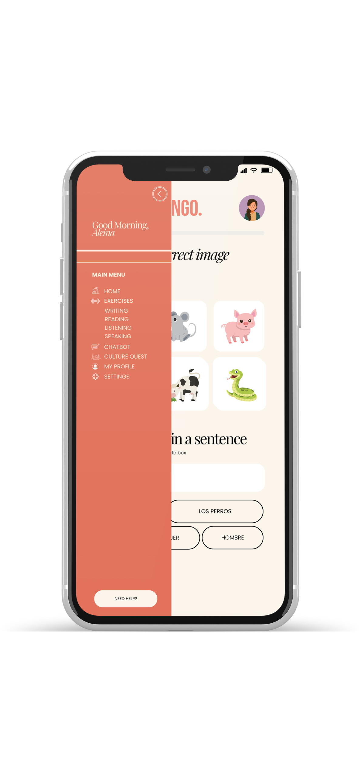
While the interface is clean, some users found the icons at the bottom (for lessons, quizzes, chatbox, etc.) ambiguous. Adding text labels or tooltips could make navigation clearer, especially for new users unfamiliar with the symbols.
What I changed
As mentioned in the feedback, the navigation did need further clarity. As you can see in the above image, I removed the panel at the bottom of the application and turned it into a side bar navigation. The navigation now has images and accompanying text.
Level Selection Guidance
The level selection screen (Beginner, Intermediate, Advanced) was simple, but some users wanted more guidance on which level they should select, such as a placement test or skill description under each option to ensure they picked the right one.
What I changed
As users wanted more guidance on which level they should select, I adjusted the application by adding a button to the “Please select a level” screen. I then added a hover effect, to explain exactly what this means. The user would then take a proficiency test.
Progress Tracking Detail
The progress screen was useful but could be enhanced by offering more granular feedback. For example, users wanted to see which specific skills they needed to improve on (e.g., vocabulary, grammar), rather than just an overall percentage.
What I changed
Again, here I used another tooltip. When the user hovers over the question mark, they would be given further context as to what areas they need to improve on.
REFLECTION
What I learnt from this project
Through this project, I learned how crucial it is to deeply understand user needs and deliver a product that stands out in a competitive market. I developed skills in balancing innovation with practicality, prioritising user engagement, and leveraging feedback for continuous improvement. This experience also highlighted the value of creativity and strategic thinking in building something meaningful.
Key learnings include:
The importance of listening to user feedback to refine features.
Strategies for creating differentiation in a saturated market.
How to design a seamless and engaging user experience.
The impact of localisation and cultural sensitivity on user satisfaction.
Effective ways to market and position a new app to build trust and visibility.


