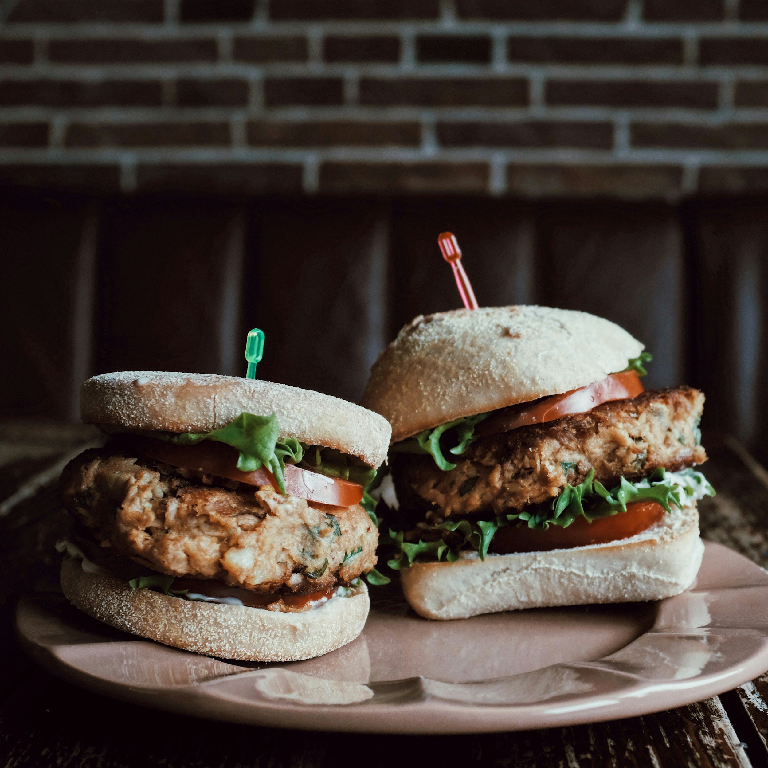
A user-friendly, iOS-compatible food delivery app.
OhSoYum
CLIENT
OHSOYUM (CONCEPTUAL PROJECT)
PROJECT TIMELINE
21st JUNE - 13th SEPTEMBER
MY ROLE
LEAD UI/UX DESIGNER
INDUSTRY
ONLINE FOOD DELIVERY
OVERVIEW
Project summary
WHAT I DID
User Research & Analysis, Information Architecture, Sitemap, Wireframing, Design, Prototypes, Usability Testing
ABOUT
The food delivery industry has rapidly grown into a £200 billion global market, driven by consumer demand for convenience and quick service. Despite this growth, there's still significant opportunity for innovation, particularly in creating user-friendly platforms that cater to health-conscious, busy, and budget-minded individuals. This project was initiated to address this gap by designing a food delivery app that is not only efficient but also visually appealing and easy to use.
GOALS
The primary goal of this project is to develop a seamless app that allows users to order from their favourite restaurants and have food delivered to their doorstep. Key features include order customisation, real-time tracking, secure payment, and user reviews. The app will cater to various customer needs, offering healthy and affordable options while ensuring a premium delivery experience for those willing to pay more.
"Online food delivery has become a £200 billion global industry, yet there is still plenty of room for growth as people increasingly opt for the convenience of delivery."
- Bloomberg
THE CHALLENGE
What does it take to create the ultimate food delivery experience?
The main challenge of this project was developing an app that integrates user-friendly design, real-time functionality, and customisation options while meeting diverse needs like convenience, healthy eating, and affordability. Balancing these features required attention to platform compatibility, secure payments, and reliable tracking, all while ensuring business KPIs like user acquisition and revenge growth.
The OhSoYum app addresses key user needs, such as:
Time constraints
Health-consciousness
Affordability
Convenience
Dietary filters
Meal deals

WHAT HAPPENS WHEN
The timeline
THE AUDIENCE
User personas
WHO IS THE COMPETITION?
Competitive audit
USER FEELINGS
User journey
THE LAYOUT
Information Architecture
BLUEPRINT
Sketches & wireframes
USER FEEDBACK
Usability testing
THE OHSOYUM STYLE
Style guide & UI graphics
The OhSoYum style guide has a striking, nature-inspired harmony that combines depth, warmth, and lightness
Introducing OhSoYum
I designed a clean and intuitive interface with a focus on ease of navigation, allowing users to quickly browse restaurants, customise orders, and check out with minimal effort. I ensured the app adhered to both iOS design guidelines for a seamless experience across devices.
User-friendly interface
OhSoYum is perfect for food enthusiasts looking for a blend of convenience and exclusivity. It appeals to a modern, busy demographic who values quality, curated options, and quick access to diverse cuisines.
Overall, OhSoYum is a chic, elevated take on the food delivery experience. It combines aesthetic appeal with practical, user-centric features that make it easy to discover and order great food.
Real-time tracking
To enhance user satisfaction and transparency, I integrated real-time order tracking and delivery notifications, allowing users to monitor their order status from preparation to delivery, which addresses the need for reliable service and peace of mind.
Customisation
To meet the needs of health-conscious users, I implemented robust order customisation, including options for dietary restrictions, ingredient exclusions, and portion control. This allows users to personalise their meals based on health requirements or preferences.
REFLECTION
What I learnt from this project
IMPORTANCE OF USER RESEARCH
Conducting thorough user research, including competitor analysis and persona development, was crucial in understanding user needs and preferences. This process helped tailor the app features to address specific pain points effectively.
ITERATIVE DESIGN PROCESS
Emphasising an iterative design approach allowed for continuous feedback and improvement. Testing wireframes with users, gathering their input, and refining the designs based on their suggestions demonstrated the value of user-centric design.
BALANCING FEATURES & USABILITY
While incorporating advanced features (like real-time tracking and customisation options) was essential, maintaining a balance between functionality and usability ensured that the app remained intuitive and user-friendly. Simplicity in design often leads to a better user experience.
FEEDBACK IS ESSENTIAL
Gathering user feedback at multiple stages of the design process proved invaluable. Users provided insights that highlighted areas for improvement, helping to refine the app's functionality and overall aesthetic
CONCLUSION
This project highlighted the value of a user-centred design approach, iterative testing, and data-driven insights. The lessons learned will inform future projects, ensuring that user needs remain at the forefront of the design process.


